There are a variety of UX techniques that can be used to create a more rich interactive environment. However, each project has limiting factors such as resource budgets and cognitive load, which is complicated further in MR due to the ability of the user to interact with their physical environment. With this in mind, while building MooR we developed a Mixed Reality Design Assessment Tool to help guide designers in determining the User Experience complexity required for their project. This is based off a framework I developed in 2013 for designing gameful activations within public spaces.
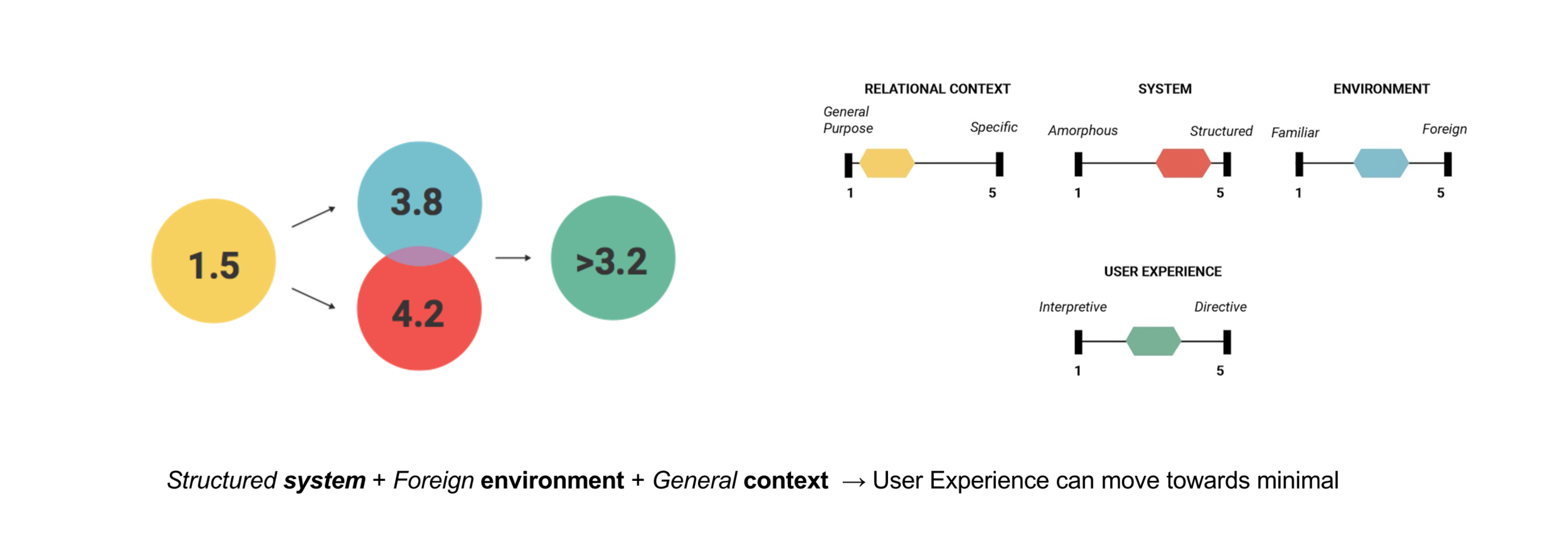
We determined that there are four key forces that should be considered when building products for the HoloLens and for MR: Relational Context, System Design, Environment Design which in turn influences the UX forces of the experience. The overarching forces as well as individual elements within can be described using a series of polar relationships that can be qualitatively evaluated using dials between the polar values, which we have designated as 1-5.
Each force is assessed over its own polar values as described in the diagram above. It is important to note that not every relationship outlined in the following sections will apply to each project, but the designer should apply ones that relate to their project.
Amorphous system + Familiar environment + General context → User Experience can be more interpretive
Structured system + Foreign environment + Specific context → User Experience might require more directiveness
RELATIONAL CONTEXT
What is the goal of this application?
The Relational Context is the first force that is considered in a project. It is essentially the project brief, research question or provocation. This is determined by the Authorship, Experience Level of the use, Delivery of the product, Location and Narrative quality of the experience as described above. These relationships help weigh the project towards whether it is meant for General Purposes or Specific contexts. A project with a very Specific purpose would conceptually require a more directed User Experience. For example, with MooR, the experience would be pretty authored, with curators being specifically invited to use the app, giving it a score of 3.8
SYSTEM
How much independence or structure will you give the user?
Building out the other relationships within the System force, one should consider the Rules, System Feedback, App Mechanics, Invitation to interact, and Interaction modalities. These relationships help determine if the System is more Structured or Amorphous. The more structured the System requirements, the less Interpretive the User Experience can be.
EXPERIENCE MATRIX
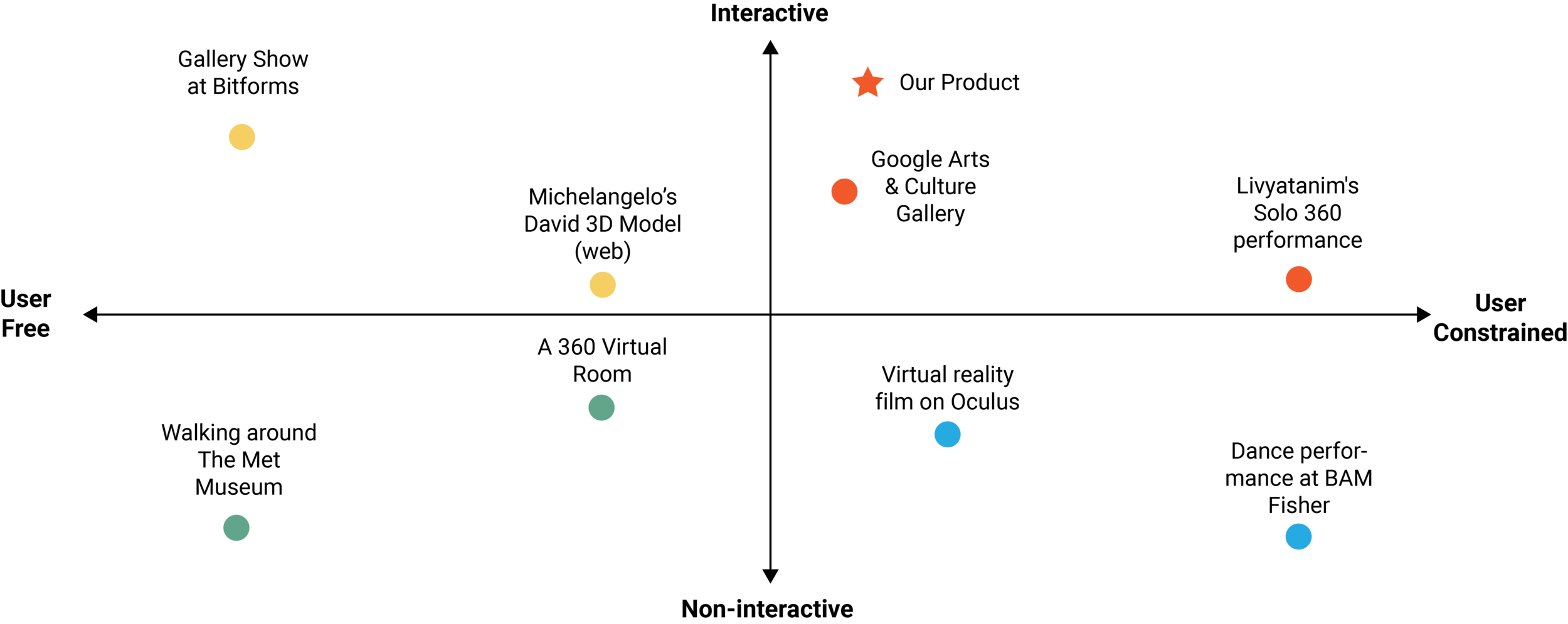
While developing MooR, it was determined quickly that there are two key relationships at play within the system design for the HoloLens and for MR: what the environment can do and what the user can do. This was visualized in an Experience Matrix of Interactivity vs Freedom (see below). The top left quadrant provides the most freedom and immersiveness by allowing the user to freely explore a given space and interact with objects at any time. For example, the user would have a guided experience up to a certain point, but then would be encouraged to roam and explore. Interaction wise, MooR is considered more multimodal. Besides the hand gestures, we were using Gaze as a gesture to activate as well as using physical movement.
Other MR projects may prioritize other relationships which can also be used in a similar manner using the Experience Matrix. Therefore the experience matrix is encouraged to be used in conjunction with the assessment tool.
ENVIRONMENT
How familiar will the user be with the environment?
The System and Environment Design are closely related, and are often designed together. The relationships within the Environment Design are determined by Familiarity of the environment, Audio reinforcement, rendering Materials, relationship to the Physical World and Props. The more foreign the environment the user is placed in, the more directed the UX needs to be. For example, we tried to use some cues familiar in games to indicate activation zones, however we wanted to be a lot more abstract with the desk. Assessing MooR against these polars, it is given an average score of 3.6
MAKING AN ASSESSMENT
The theory is that, in most cases, assessing the System, Environment and Context according to these polar values should allow the development of a reasonably complex User Experience.
So far, we have assessed our project to be one with a pretty specific Relational Context, a structured System, and a foreign Environment, due to the unfamiliarity of certain concepts such as the Activation Zones. Also, in determining what metaphors to use for the desk, we found that having them placed just above the user's eye level would work best, which translated into replacing an actual "desk" with more abstract objects that could exist at that height. Taking an average of all the scores from System, Environment and Relational Context gives us a guiding factor of 3.6 for User Experience. This suggests that the User Experience model should satisfy the minimum score of 3.6, and use techniques that have more directive qualities.
We went through a similar exercise for ROBORAID and worked out that their product more than satisfied the user experience requirements, which leads to a satisfactory game play.
USER EXPERIENCE
How intuitive will the User Experience be?
User Experience can be thought of as the voice of the app. It represents the intention of the app and therefore sets the tone for the user as to what they can expect. This is involves the Interface, Interaction cues, how much Information is exposed to the user, Simulation type and the Embodiedness of the App Guide. These relationships described are not an exhaustive list of UX techniques but are based on a few project examples that have been tested on the Hololens, as well as Mobile, Augmented and Virtual Reality Systems.
Because our design requirements were very much coupled with the development process, this helped guide our changes along with the user testing. Take the "desk" for example, purely floating objects made them seem like an artwork, so we decided to submerse them in a landscape to ground them. Also, although we do not have an embodied guide, we decided to use a voice guide for the project and introduced the concept of the metaphors at the "Lobby" scene. The exit was another area in question. We started from an amorphous portal, then we added an exit sign and based on feedback, since we wanted to encourage people to “walk out” of a room. We added an archway. Therefore, assessing MooR against these polars after the many changes, it is given an average score of 3.8, which satisfies the requirements determined earlier.
HEURISTICS
As mixed reality becomes more accessible and increasingly ubiquitous, we need to define new user experience heuristics for this emerging technological medium. Over the course of this project, we developed a general set of UX guidelines and practices that combined with the MR Design Assessment Tool we hope will lay the groundwork for a more comprehensive set of best practices:
1. The key elements of the experience should exist on the same level of the user's sight line. Through testing, we found that users perceived holograms to be more realistic and engaging if we placed them at this specific height.
2. The most important elements of a scene should remain visible from any point in the room.
3. Users want to be able to experience a moment fully within their field of view. The scale of any holographic object should fit entirely in the HoloLens FOV or viewport.
4. Certain moments of an experience, especially if involving artworks, may require placing objects on the floor. In these instances, it is important to cue or prompt the users to look down, since many of them do not naturally do so.
5. If users need to be moved through or around a space, pointers or other wayfinding attention-grabbers should be used.
6. The location of the ground is as important the location of the walls. In the case of not using spatial mapping, it should calibrated properly.


