ABOUT
This thesis is about the relationships of body and space within immersive realities and how they influence the design of mixed reality environments. It looks for opportunities within the patient care environment through a series of design proposals and hypotheses to investigate the following research questions:
What is the role of gesture, and in particular drawing as a form of gesture, as one of the inputs to a mixed reality system?
Can mixed reality interfaces help with communicating with and educating stakeholders within the patient care environment? What systems within the patient care environment would be of interest to connection with a mixed reality system?
Through my project, I hypothesized that mixed reality was a technology that would create better body and space relationships, and therefore through proprioception and kinesthetic learning, facilitate the development of interfaces that would improve clinician patient relationships. The project consisted of a series of five prototypes of varying levels of fidelity, exploring the potential of future mixed reality technology within the patient care experience, thinking through the use of drawing gestures and movement as a new input functionality. These prototypes were used to elicit feedback and design input from my partners with the NYU-X Lab and Future Reality Lab. Combined with a survey to medical practitioners across the US, London, Australia and Singapore, I was able to identify that the area of assessment and communication can benefit the most from mixed reality applications, the next being agency and control.
The final prototype was a series of immersive scenes developed in the Microsoft Hololens to illustrate how mixed reality could be incorporated into a hospital scenario:
Recording a patient's pain scale over time with the ability to play a video back for summary
Using holographic markers on the body to guide CPR
HUD that nurses could access during emergency situations
ABSTRACT
Mixed reality technology presents the ability to access digital overlays in real space with our various senses through holographic technology, camera vision and voice recognition. This adds additional context to our physical worlds and the ability to create new experiences. Mixed reality affords the use of three-dimensional (3D) digital objects, allowing us to access different parts of the brain than text and flat graphics can access.
Drawing inspiration from a number of areas, I look to the study of skeuomorphisms, embodied cognition, game design, human computer interaction, human robot interaction, and space design theories, as well as qualities of light and materials within virtual realities and the hardware platforms to derive meaningful relationships with mixed reality. An underlying design principle of “making the invisible visible” drove many of the concepts explored in the project, guiding some of the solutions to problems uncovered in the research.
My project explores the potential of future mixed reality technology within the patient care experience, thinking through the use of drawing gestures and movement as the main input functionality. Connecting mixed reality to physical reality through Internet of Things (IoT) Wi-Fi networks or the hospital database offers up the potential to incorporate these interfaces and experience into the daily workflow. The opportunities I see can be broadly categorized within these areas: agency and control, rehabilitation and escapism, safety and guidance, and assessment and communication.
Using the Microsoft Hololens and New York University (NYU) Future Reality Lab’s Chalktalk as research and development tools for the project, I was able to create immersive walkthroughs to present concepts for a future mixed reality system and develop annotative gestural controls to connect virtual user interfaces with real life objects. Through this combination of contextual inquiry, design and prototyping research, as well as survey of opportunities, findings are that the area of assessment and communication can benefit the most from mixed reality applications.
PROCESS
Project inspiration
I am starting my thesis project on the basis of Practice-Led research, which is a conceptual framework that allows a researcher to incorporate their creative practice, creative methods and creative output into the research design and as a part of the research output. In particular, Two prior projects in the field of Mixed Reality - StarCatcher and Moor, along with the MR Design Assessment Tool have inspired me to pursue a full body of research and a detailed prototype to test out certain theories about User Experience within Mixed Reality. My pre-thesis work discussed the body as an interface to explore intimacy via wireless body communications. The main page discusses and pulls together my research, prototypes as well as motivations for the topic. The final presentation discussed these concepts in the context of control and vulnerability.
Presentation Prep
Meeting the Future Reality Lab
Chalk Talk
Holojam
Future of Storytelling Festival
Meeting with the NYU-X Lab
Holodeck
Description of projects
Development of project teams
Developing a project
Considering conversations with various students and professors within the Future Reality and NYU-X Lab, requirements of the NSF grant around Chalk Talk and Smart Homes, as well as issues of patient care, I am developing a project around a Smart Patient Room for patients with limited mobility. Areas I am beginning to develop User Interface and Interaction Modalities:
Ability to interacting and controlling the environment
Information management and recall
I was able to workshop this project concept with one of my external thesis advisors, Nick Kamuda. The picture below from Nick illustrates our discussion notes.
Methodology Outline
The main methodology used in the project is User-Centered Design, with guiding principles of Speculative Design in the prototyping process. We describe User-Centered Design through the process of analyze, design, evaluate, implement and the feedback loop between the processes.
Analyze: Relational Context
Describe an approach to breaking down the problem space
Stakeholder/Contextual Interview, determine specificity of product. Consider authorship, experience level of use, delivery of the product, location and narrative quality of the experience
Design and Prototyping:
Guiding Pricinple of Speculative Design
Props and environment - plausible future
Suspen sion of disbelief
System Design: Consider the Rules, System Feedback, App Mechanics, Invitation to interact, and Interaction modalities
Environment Design: Consider Familiarity of the environment, Audio reinforcement, rendering Materials, relationship to the Physical World and Props
User Experience: Consider Interface, Interaction cues, how much Information is exposed to the user, Simulation type and the embodiedness of the App GuideProps
User Testing of Prototype
Developing the questionaire
Participant selection
Set up the testing environment
Tutorial for participants
Running of user test
Evaluation: Collection of data through triangulation
Survey questionnaire
Observation and Phenomenology
Discussion with participants
Count time that people spend doing a task
First prototype: Setting the scene in the Hololens
I demonstrated the Hololens app to visiting critics as well as members of the NYU X-Lab. The summary of feedback and brainstorms:
The person was concerned that they would accidentally hit the emergency button (cube). Along this same feedback, if the person was worried about hitting the button, they may not move as freely as they would otherwise, which may hinder them from physical activity (a bad thing).
However, this could be better than current scenarios where the button is not easy to find, response is slow in emergency situations
Another was that the cube could be used to get the person to do ROM (Range of Motion) exercises. For example, the patient has to follow the cube with their hand and arm for the purpose of exercising their shoulder. (I like this, seems like a good use for a hologram but yes there are definitely liability issues with testing this one)
Could be really useful in long term patient care, with diseases such as dementia or even in palliative care scenarios, as there is efforts to transform these experiences for the patients to make things more comfortable and more like how they are used to living.
Bringing in some elements of fantasy could be conceivably benefitial for patients who have limited mobility to bring about changes of environments. (We discussed this last meeting too, I think supports the idea of giving patients more agency to change their environments, both digital and physical)
Communication between patient and clinician can be improved through better tools, such as the communication of pain. In some cultures, talking about the body is difficult, clinicians use mannequin dolls that women can point to to describe what they're feeling. (Supports some research I've done around chronic pain and the difficulty of communicating it. Could be a good use for holograms, where people could use more expressive tools to keep track and communicate their pain points over time).
The ER waiting room would be a great place to employ elements of fantasy - people waiting are usually very stressed out and it would be a good way to relax them.
Also allowing clinicians to keep in contact / keep families and friends updated without having to be out there constantly. (My sister mentioned that communication with families is a really tricky thing to get right)
Prototype 2: Chalktalk communicating with a Phillips Hue
Refining the Project:
Designing an annotation based mixed reality patient care system, with a focusing on three areas:
Agency and Control
Patient Safety
Patient Assessment
Agency and Control:
Within agency and control, the patient would be able to change elements in their real environment, such as lighting and temperature, through drawing their user interface and then interacting with it to change the parameters within the controls. Here would be a user flow of the user drawing a lightbulb in Chalktalk and then having it turn on a light in the room.
The patient could also change their environment by adding digital elements such as holograms to the room, creating new scenes with animated characters that would help them change the mundane scenery that they experience on a day to day basis. This is an example of me decorating my home with holograms that my family can then interact with.
Patient Safety:
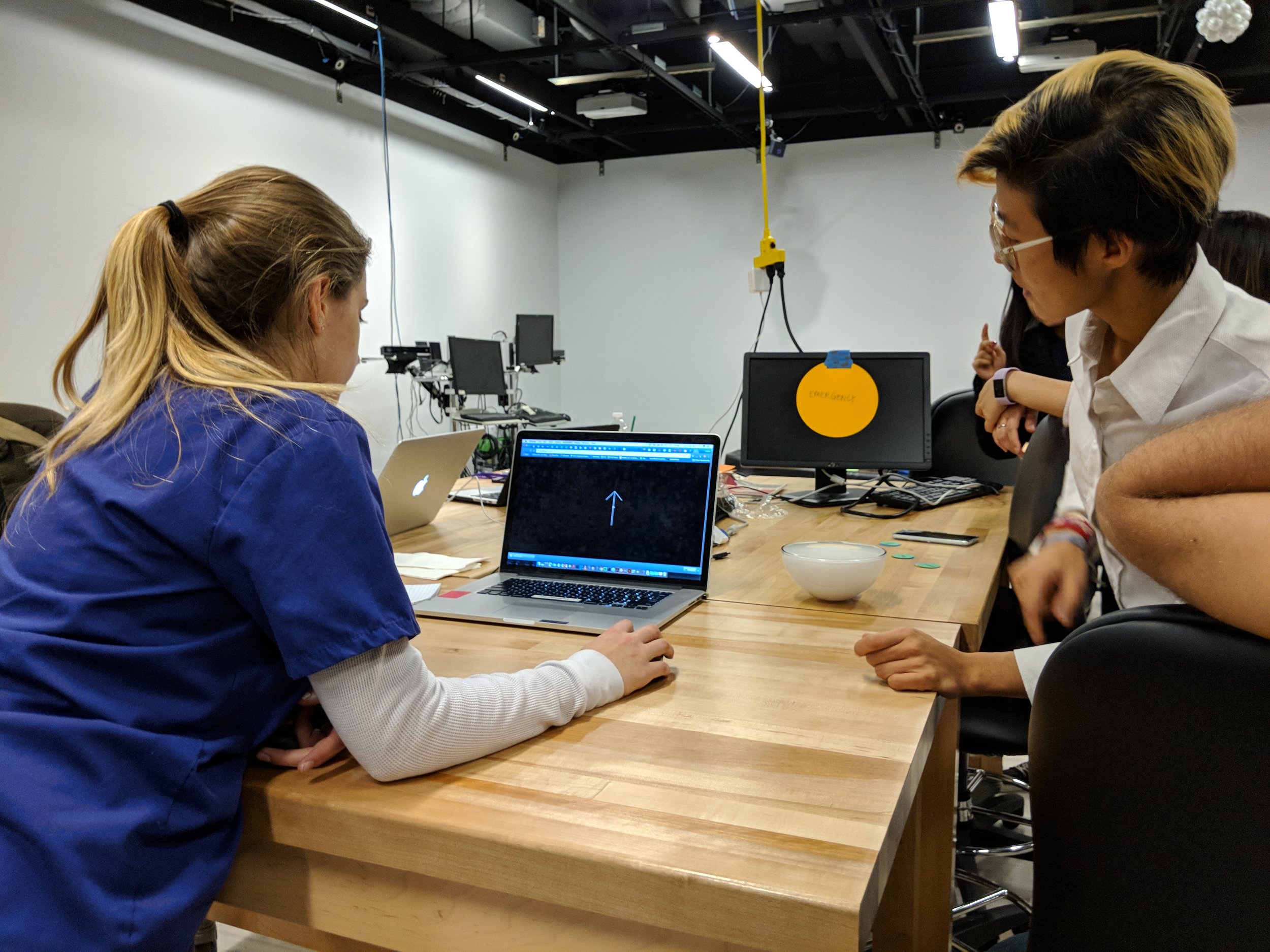
There are two elements that I am exploring within this area. The nurse call button accessed by the patient and the patient emergency button accessed by clinicians. My primary research has shown that the current state of the emergency button are whereby the button is usually on a cord that is attached to the patients bed. This often isn't within reach when an emergency happens, either because of distance or it being misplaced. I propose that similar to turning on a light, a clinician could draw the button when required with a simple symbol. I will conduct A/B testing with a series of icons that can be drawn on Chalktalk, to evaluate which gestures would be most appropriate for this situation. In the figure below, I've illustrated three pairs of drawings in chalktalk, In each pair, the left image is my drawing, and the right image is the icon it renders.
PROTOTYPE 3: Patient Medical Assessment:
In developing the interface for patient records, I studied patient record samples from various sources. Components of a patient record consists of:
Medical History
Laboratory Test Results
Diagnostic Test Results
Problem List
Clinical Notes
Treatment Notes
Review of Systems:
General
Skin
Head
Eyes
Ears
Nose
Mouth
Throat
Neck
Respiratory System
Cardiovascular System
Gastrointestinal System
Genitourinary System
Nervous System
Musculoskeletal System
Neuropsychiatric System
Endocrine System
Peripheral Vascular System
I recognize that it is not the entire system of EMR that is appropriate to be input and visualized in mixed reality, whereas it is the areas where visualization and elements that require daily action that would be suitable for mixed reality. The problem list is a list of issues, in decreasing order of importance, that require management in the patient (Spooner and Pesataru, 44). These would generally require input from the admitting practitioner, nurse, pharmacist, nutritionist, respiratory therapist, and physical therapist may each have their own list of priorities. These could all be recorded in mixed reality and viewed together or in a tabbed form. Clinicians that visit patients daily often make their own Clinical Notes such as recording vitals, pain assessment and patient activities (Spooner and Pesataru, 45). Treatment notes are utilized most frequently in the in patient setting and can be consist of medication, physical therapy, occupational therapy, respiratory therapy and nutritionist needs (Spooner and Pesataru, 46). These can be input through a usual keyboard input and then a checkbox could appear on a daily basis for those needs.
Draft Wireframe:
The wireframe provided a useful point of reference to begin to describe how this could work in mixed reality, however it became clear that I would need to build this mixed reality to be able to gain meaningful feedback.
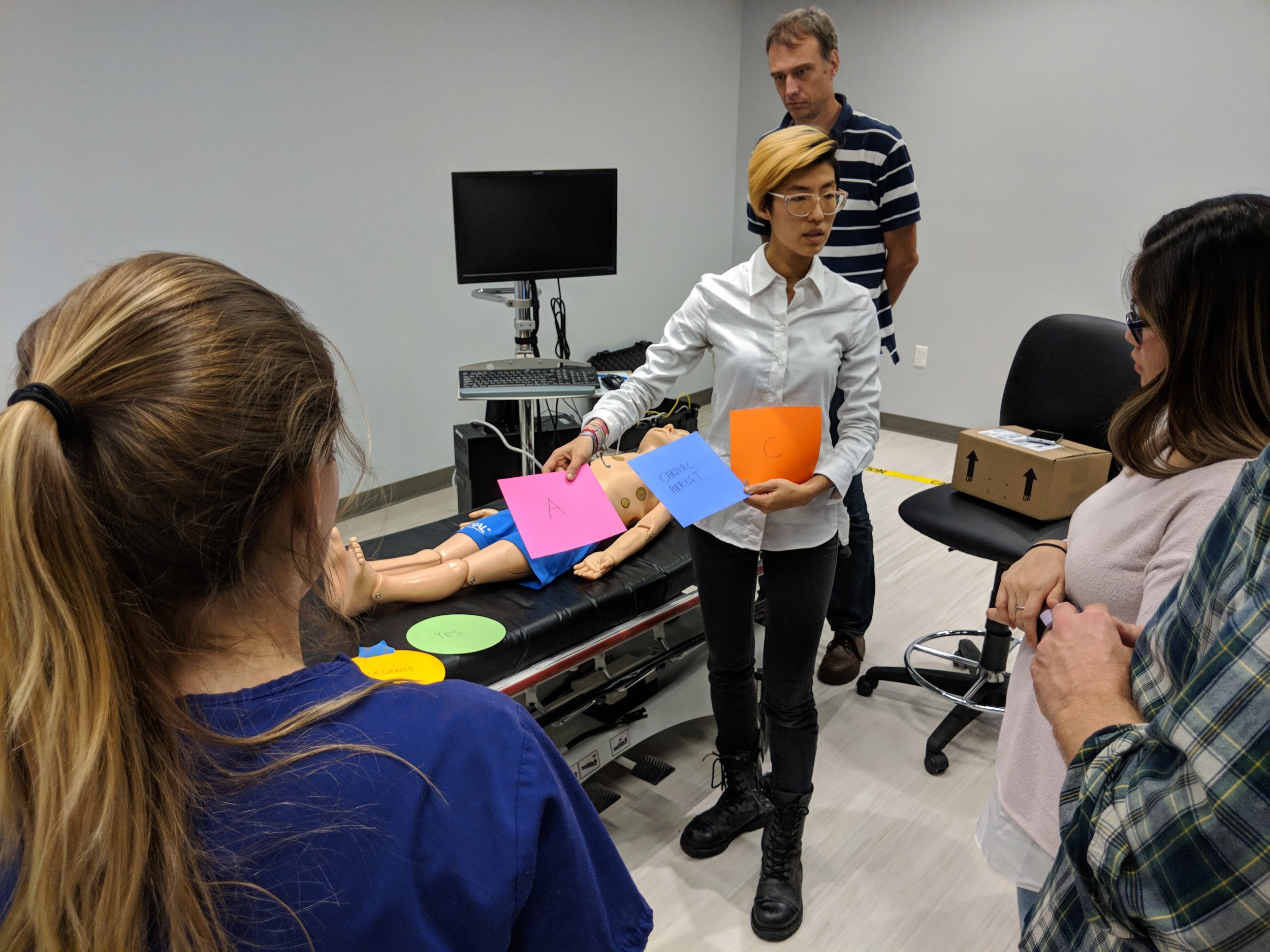
Prototype 4: Bodystorming a Cardiac Arrest Protocol
I wanted to go into one of the scenarios in more detail to think about the user interface in context of the space. I decided to pursue an emergency scenario as the main scenario for the project, as these had specific protocols that most hospitals had to follow and was well documented by advanced cardiac life support (ACLS) certification institute.
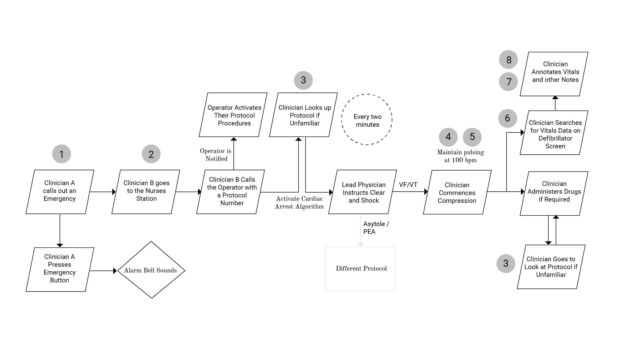
Based on interviews and videos from the ACLS (Patwari) I documented the cardiac arrest algorithm in the figure above and noted the issues that arise:
Emergency button inconveniently located
Communication delays in having to go to nurse's station to call operator
Protocols regardless of simplicity, unless often performed, are hard to remember
Nurses were sometime unclear which parts of the body to work on
Nurses are recommended a specific pulse speed to follow and it can be hard to keep up with that bpm
Notes were mostly recorded on paper first and retroactively entered into the system
Time often not recorded in these situations
Not always having line of sight to the defibrillator to do a pulse check
I identified an opportunity to add to the flow of the emergency scenario with a mixed reality system in the figure below.
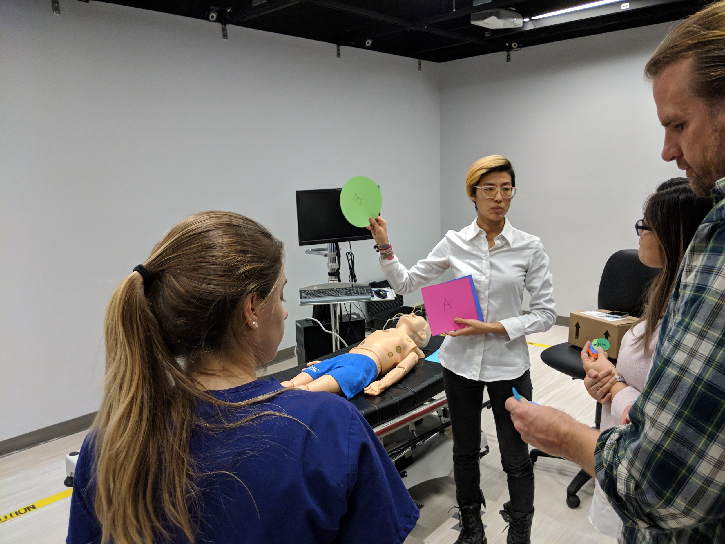
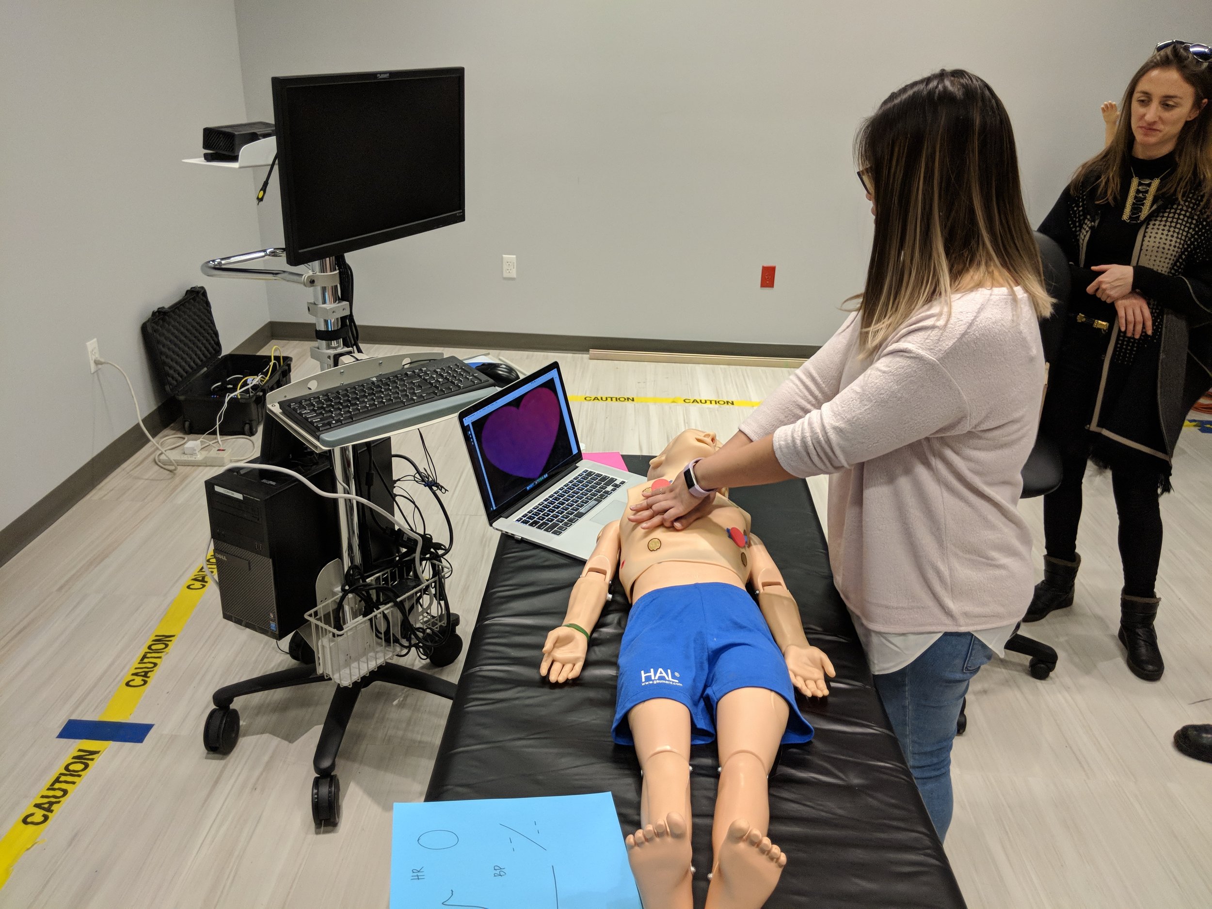
The workshop was run at the NYU-X Lab in three sections: priming, calling the emergency, the CPR cycle.
SURVEY:
During the time of the workshop, I also collected results from a survey I ran, which can be found here. I had separated the questions into three sections, one was opportunities for patients, the second was opportunities for clinicians and the third was for patient clinician shared opportunities. I analyzed the results from 30 participants, summarized the results below and created heat maps for questions that got the highest number of 7s compared to other questions in that category. Each color within the map represents the percentage of responses corresponding score between 1-7 as well as the count, 1 = "not useful" and 7 = "extremely useful". Questions categorized in assessment and communication, resulted in the most number of positive responses overall, with agency and control scoring closely to rehabilitation and escapism. These results were helpful to triangulate against feedback from the workshop and other prototypes.
Assessment and Communication: This category scored the highest overall. The question that received the highest percentage of 7’s:
“When discussing patient problems, clinicians can pull up a 3D human form (or even annotate the patient themselves), on which they can record issues described by the patient on the form. This can be a recording over time, which can be played back via animation for other clinicians or for the patient themselves. This could potentially be something provided to the patient with their release form.”
Agency and Control: The highest score for patient applications were for patients to be able to order their food off a virtual menu with 63% of the participants scoring 6 and 7s, and 60% scoring 6 and 7s for patients being able to change their physical environment. The scenario allowing patients to activate their patient call bell received lower scores.
The question that received the highest percentage of 7’s:
“Patient can access their food menu in MR and make selections through the interface.”
Rehabilitation and Escapism: The highest score was patients to be able to play virtual sports at 43% of participants selecting “extremely useful” and 33% participants selecting “extremely useful” for patients being able to change their virtual environment. Results from scenarios for patient applications could be biased as there were very few responses collected by patients who have spent time in a hospital.
The question that received the highest percentage of 7’s:
“Patients could play virtual sports that encourage movement in their room, such as miniature golf, tennis or bowling.”
Safety and Guidance: There were two scenarios describing the ability to draw a symbol to call an emergency protocol, one for the patient to activate their emergency call bell and the second for the clinician to signal and emergency with selections for which protocol on the interface. Both these questions had 56% of participants scoring 6 and 7’s. The scenario for protocol guidance in mixed reality also received a similar score. One participant’s feedback was that they would like to “be able to access them quickly in an emergency
The question that received the highest percentage of 7’s:
“Often, patients may have difficulty locating their call bell if the device has fallen off the bed or they are not in bed. With MR, I imagine the patient is able to activate their call bell from anywhere they are in the room through drawing a symbol such as an “X”, “cross” or “circle”.”
PROTOTYPE 5: Immersive Scenarios on Hololens
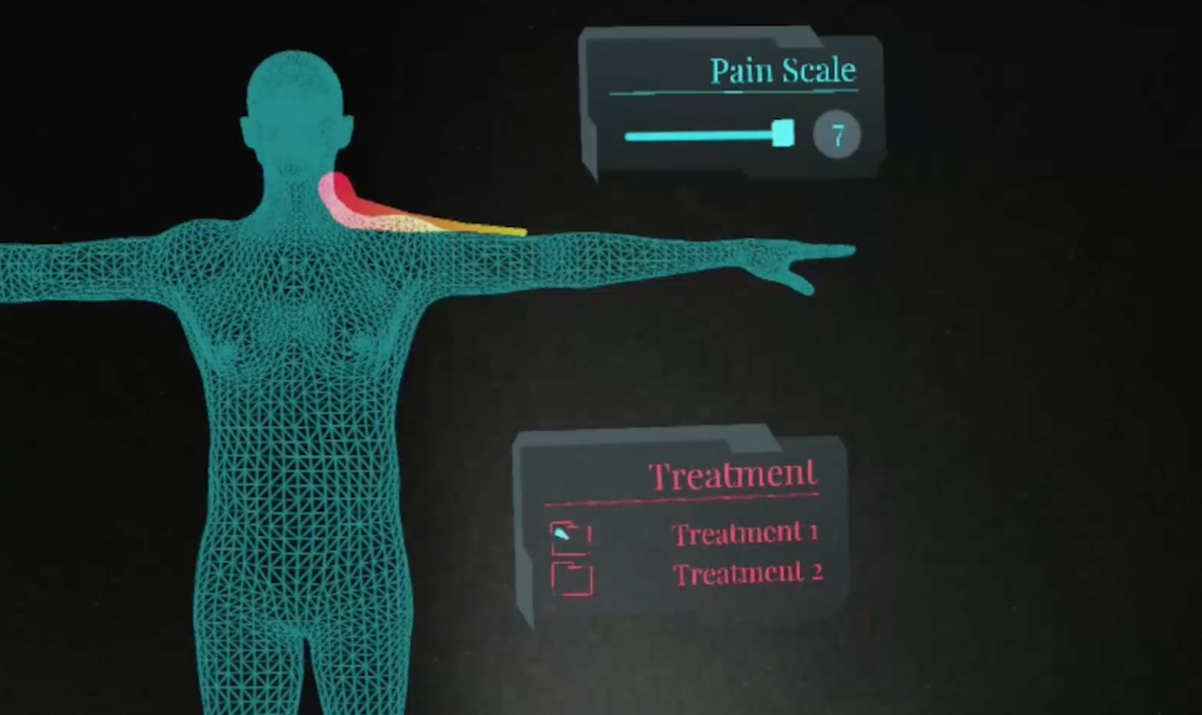
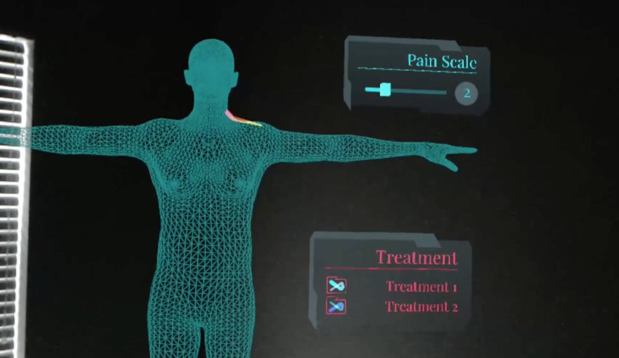
I took the quick wireframe developed in Prototype 3 into mixed reality. A 3D human form is introduced with an example scenario of a clinician having recorded their patient’s shoulder and neck pains three times by annotating on the form. As the level of pain could vary from day to day, the size of the line in the prototype changes from thick to thin, to visually reflect the level of pain experienced by the patient throughout the day. Sliders that show a Likert pain scale would also be available for the clinician to record the pain more quantitatively. If the patient required treatment, a list would be available in the form of a checkbox, that the clinician could tick off once completed. The overall color scheme of the interface is blue and grey, which are preferable interface colors, while the treatment text is colored in red, as this information is important and would require attention. The annotations made throughout the day are played back in an animated fashion for discussion with the next clinician.
In this scene above, the pain starts off intensely, represented by a thicker line, with a high pain scale shown in Figure 23. The pain reduces over the course of the recording, as treatment is being administered to the patient.
The following two videos describe:
Using holographic markers on the body to guide CPR
HUD that nurses could access during emergency situations


